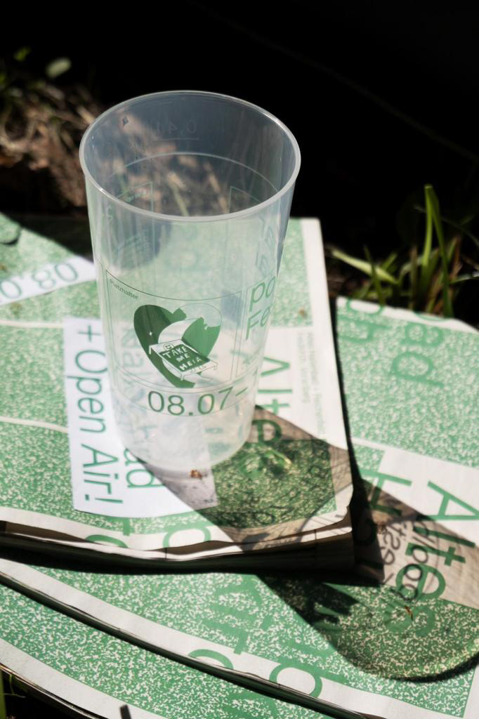
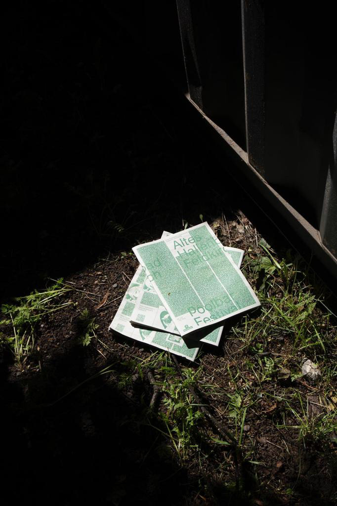
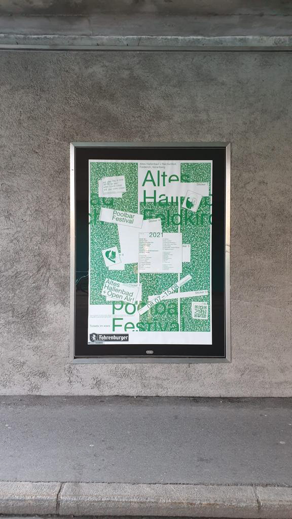
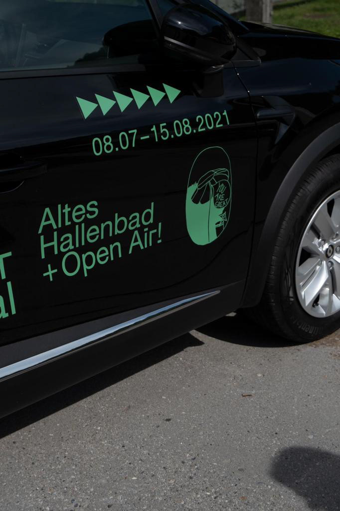
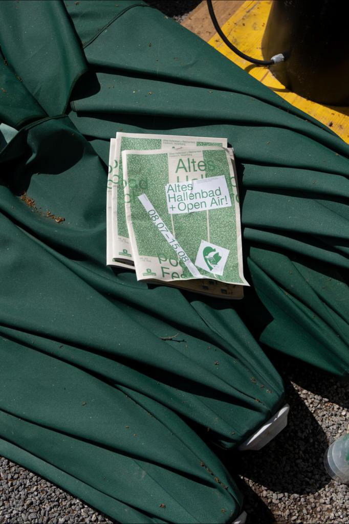
Designing the identity of the Poolbar Festival in the shadow of the pandemic was a real privilege. In the course of the brainstorming process, the graphics team agreed to implement the theme in a poster concept that playfully interacts with visitors. The result was a poster-sticker system that conveys both crisis-proof information (poster 1: location, name, website) and information that is still uncertain due to the constantly changing situation (poster 2: line-up, date, info).
The visual aesthetics were inspired by a Covid-19 test form, which on the one hand symbolizes impersonal communication: The form's security stripes flow into the first poster variant as the main element. On the other hand, the green image noise (stripes) reminiscent of meadows or even water and refers to the Poolbar Festival, which remains subject to the uncertainty caused by the pandemic. Noise also symbolizes emptiness. The coldness of this form is nonetheless broken by humorous illustrations that bring back personality and humanity. These function as 'Funny Reminders (“Take care of yourself and others!”) and also flow into the poolbar merchandise. Together with: Michael Marte, Konstatnin Wagner, Isabella Schweitzer, Jamila
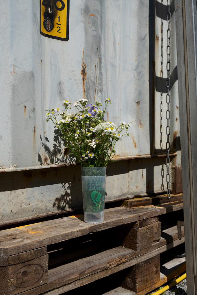
Photos by: Isabella Schweitzer
The visual aesthetics were inspired by a Covid-19 test form, which on the one hand symbolizes impersonal communication: The form's security stripes flow into the first poster variant as the main element. On the other hand, the green image noise (stripes) reminiscent of meadows or even water and refers to the Poolbar Festival, which remains subject to the uncertainty caused by the pandemic. Noise also symbolizes emptiness. The coldness of this form is nonetheless broken by humorous illustrations that bring back personality and humanity. These function as 'Funny Reminders (“Take care of yourself and others!”) and also flow into the poolbar merchandise. Together with: Michael Marte, Konstatnin Wagner, Isabella Schweitzer, Jamila
Photos by: Isabella Schweitzer
Fotos: Isabella Schweitzer